
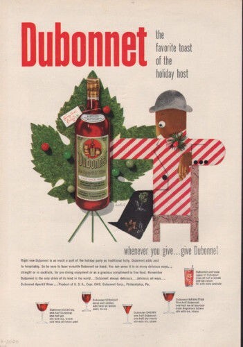
1949 BONNET WINE HOLIDAY CHRISTMAS PAUL RAND ARTIST MODERN DISTILL AD 7442
Specifications
| All Returns Accepted | ReturnsNotAccepted |
KEYWORDS: DUBONNET, HOLIDAY, CHRISTMAS, COCKTAIL, STRAIGHT, SHERRY, MANHATTAN, SODA, JIGGER, HOST DESCRIPTION OF ITEM: A GREAT VINTAGE ORIGINAL ADVERTISEMENT FOR DUBONNET APERITIF WINEARTIST: Paul Rand (born Peretz Rosenbaum; August 15, 1914 – November 26, 1996) was an American art director and graphic designer, best known for his corporate logo designs, including the logos for IBM, UPS, Enron, Morningstar, Inc., Westinghouse, ABC, and NeXT. He was one of the first American commercial artists to embrace and practice the Swiss Style of graphic design. Rand was a professor emeritus of graphic design at Yale University in New Haven, Connecticut where he taught from 1956 to 1969, and from 1974 to 1985.[1][2] He was inducted into the New York Art Directors Club Hall of Fame in 1972. Early life and education[edit] Paul Rand was born Peretz Rosenbaum on August 15, 1914 in Brooklyn, New York.[3] He embraced design at a very young age, painting signs for his father's grocery store as well as for school events at P.S. 109.[4] Rand's father did not believe art could provide his son with a sufficient livelihood, and so he required Paul to attend Manhattan's Haaren High School while taking night classes at the Pratt Institute. Rand was largely "self-taught" as a designer, learning about the works of Cassandre and Moholy-Nagy from European magazines such as Gebrauchsgraphik."[5] Rand also attended Parsons School of Design and the Art Students League of New York.[1] Early career[edit] His career began with humble assignments, starting with a part-time position creating stock images for a syndicate that supplied graphics to various newspapers and magazines.[4] Between his class assignments and his work, Rand was able to amass a fairly large portfolio, largely influenced by the German advertising style Sachplakat (object poster) as well as the works of Gustav Jensen. It was around this time that he decided to camouflage the overtly Jewish identity conveyed by his name, Peretz Rosenbaum, shortening his forename to 'Paul' and taking 'Rand' from an uncle to form a Madison Avenue-friendly surname. Morris Wyszogrod, a friend and associate of Rand, noted that "he figured that 'Paul Rand,' four letters here, four letters there, would create a nice symbol. So he became Paul Rand."[3] Roy R. Behrens notes the importance of this new title: "Rand's new persona, which served as the brand name for his many accomplishments, was the first corporate identity he created, and it may also eventually prove to be the most enduring."[3] Indeed, Rand was rapidly moving into the forefront of his profession. In his early twenties, he was producing work that began to garner international acclaim, notably his designs on the covers of Direction magazine, which Rand produced for no fee in exchange for full artistic freedom.[4] Among the accolades Rand received were those of László Moholy-Nagy: Among these young Americans, it seems to be that Paul Rand is one of the best and most capable ... He is a painter, lecturer, industrial designer, [and] advertising artist who draws his knowledge and creativeness from the resources of this country. He is an idealist and a realist, using the language of the poet and business man. He thinks in terms of need and function. He is able to analyze his problems but his fantasy is boundless.[4] The reputation Rand so rapidly amassed in his prodigious twenties never dissipated; rather, it only managed to increase through the years as his influential works and writings firmly established him as the éminence grise of his profession.[5] Although Rand was most famous for the corporate logos he created in the 1950s and 1960s, his early work in page design was the initial source of his reputation. In 1936, Rand was given the job of setting the page layout for an Apparel Arts (now GQ) magazine anniversary issue.[4] "His remarkable talent for transforming mundane photographs into dynamic compositions, which ... gave editorial weight to the page" earned Rand a full-time job, as well as an offer to take over as art director for the Esquire-Coronet magazines. Initially, Rand refused this offer, claiming that he was not yet at the level the job required, but a year later he decided to go ahead with it, taking over responsibility for Esquire's fashion pages at the young age of twenty-three.[6] The cover art for Direction magazine proved to be an important step in the development of the "Paul Rand look" that was not as yet fully developed.[4] The December 1940 cover, which uses barbed wire to present the magazine as both a war-torn gift and a crucifix, is indicative of the artistic freedom Rand enjoyed at Direction; in Thoughts on Design Rand notes that it "is significant that the crucifix, aside from its religious implications, is a demonstration of pure plastic form as well ... a perfect union of the aggressive vertical (male) and the passive horizontal (female)."[7] Corporate identities[edit] Rand's most widely known contributions to design are his corporate identities, many of which are still in use. IBM, ABC, Cummins Engine, UPS, and Enron, among many others, owe Rand their graphical heritage.[5] One of his strengths, as Moholy-Nagy pointed out,[4] was his ability as a salesman to explain the needs his identities would address for the corporation. According to graphic designer Louis Danziger: He almost singlehandedly convinced business that design was an effective tool. [. . .] Anyone designing in the 1950s and 1960s owed much to Rand, who largely made it possible for us to work. He more than anyone else made the profession reputable. We went from being commercial artists to being graphic designers largely on his merits.[4] Rand's defining corporate identity was his IBM logo in 1956, which as Mark Favermann notes "was not just an identity but a basic design philosophy which permeated corporate consciousness and public awareness."[8] The logo was modified by Rand in 1960. The striped logo was created in 1972. The stripes were introduced as a half-toning technique to make the IBM mark slightly less heavy and more dynamic. Two variations of the "striped" logo were designed; one with eight stripes, one with thirteen stripes. The bolder mark with eight stripes was intended as the company's default logo, while the more delicate thirteen stripe version was used for situations where a more refined look was required, such as IBM executive stationery and business cards. Rand also designed packaging, marketing materials and assorted communications for IBM from the late 1950s until the late 1990s, including the well known Eye-Bee-M poster. Although Ford appointed Rand in the 1960s to redesign their corporate logo, it refused to use his modernized design.[6] Although the logos may be interpreted as simplistic, Rand was quick to point out in A Designer's Art that "ideas do not need to be esoteric to be original or exciting."[7] His Westinghouse trademark, created in 1960, epitomizes that ideal of minimalism while proving Rand's point that a logo "cannot survive unless it is designed with the utmost simplicity and restraint."[7] Rand remained vital as he aged, continuing to produce important corporate identities into the eighties and nineties with a rumored $100,000 price per single design.[5] The most notable of his later works was his collaboration with Steve Jobs for the NeXT Computer corporate identity; Rand's simple black box breaks the company name into two lines, producing a visual harmony that endeared the logogram to Jobs. Jobs was pleased; just prior to Rand's death in 1996, his former client labeled him "the greatest living graphic designer."[3] Later years[edit] Rand devoted his final years to design work and the writing of his memoirs. In 1996, he died of cancer at age 82 in Norwalk, Connecticut.[9] He is buried in Beth El Cemetery.[10] DATE OF ** ORIGINAL ** ADVERTISEMENT: 1949 DATE PRINTED ON ITEM: YES ITEM GRADE: FINE CONDITION: CLEAN , PERFECT FOR FRAMING AND DISPLAYING. PAGE SIZE: APPROX- 8" x 11-1/2" ADVERT SIZE: FULL PAGE PREMIUMS: AGE AND CONDITION At BRANCHWATER BOOKS we look for rare & unusual ADVERTISING, COVERS + PRINTS of commercial graphics from throughout the world. ALL items we sell are ORIGINAL and 100% guaranteed --- (we code all our items to insure authenticity) ---- we stand behind this. As graphic collectors ourselves, we take great pride in doing the best job we can to preserve and extend the wonderful historic graphics of the past. PLEASE LOOK AT OUR PHOTO'S CLOSELY AS THEY ARE EXACT SCANS (ALBEIT VERY LOW RESOLUTION) OF THE PRODUCT BEING SOLD..... Should you have any questions please feel free to email us and we will clarify. We ship via USPS. We are not responsible for uninsured item after mailed. WE ship items on WEDNESDAY + FRIDAY. NO CHARGE for additional like items shipped to the same address. For multiple purchases please wait for our invoice... THANKS. A Note to our international buyers. Please read before placing a bid or buying an item: **Import taxes, duties and charges are not included in the item price or shipping charges. These charges are the buyer's responsibility. Please check with your country's customs office to determine what these additional costs will be prior to bidding/buying on items. These charges are normally collected by the shipping company or when you pick the item up, this is not an additional shipping charge. We do not mark merchandise values below value or mark items as GIFTS. US and International government laws prohibit this. We are not responsible for shipping times to international buyer's. Your country's customs may hold the package for up to a month. Please contact us if you do not receive your item within a couple of weeks. We can then email you the customs form number. Please note: We charge a flat $2.00 handling fee on all international purchases. Also, we use calculated shipping based on the items weight without the box or packaging (as we make each box to fit the item sold for maximum protection) so we estimate the total shipping weight. If your shipping costs were less than charged we will refund the difference within one business day after item was shipped. We ask that payment be made within 3 days or to notify us via email otherwise. We send out a reminder payment email once and then proceed with unpaid item report on the 8th day. We carry thru with reporting and feedback if auction is not completed. **We pride ourselves on quality products, great service, accurate gradations and fast shipping.** BRANCHWATER BOOKS GRADING SCALE: GOOD-->VERY GOOD-->FINE --If you cannot give 5 star rating please contact us so we may attempt to remedy the problem, Thank you.-- --Add literary to your seller favorite list today! We will be adding vintage and unusual advertising almost daily.-- Please visit our EBAY STORE to find more vintage collectibles. Just click on the BOOK below. Branchwater Books and Ephemera 7442 Powered by SixBit's eCommerce Solution
Related Items